
Comma Cafe
Project Overview
Background
Comma Cafe is a vibrant brunch spot nestled in downtown Hamilton, ON, Canada. Specializing in Asian fusion-inspired dishes, their menu features standout items like the double meat sando and caramel sponge toffee latte. Despite being less than a year old, Comma Cafe has quickly made a name for itself, earning recognition and admiration within the local restaurant scene.
Problem
While Comma Cafe offers incredible brunch options and even dinner services, their website falls short of showcasing their full potential. The current site offers limited features, such as a basic menu that lists item names without photos, leaving much to be desired in visual appeal. Additionally, there is no information about their dinner services or the story behind their brand. This lack of visibility and accessibility makes it harder for current and potential customers to connect with the business, potentially impacting its growth and success.
Goal
Create a responsive website that better reflects Comma Cafe’s brand and makes it easier for current and future customers to learn about their food and services.
UX/UI; “Responsive Web Design”
70-80 hours
Role
Tools
UX/UI Designer; Researcher
Figma, Canva, Miro
Timeline
Project Type
Discover
Market Research
For my competitive analysis, I compared a variety of cafes and their websites, considering different scales of operation. Some were local cafes similar to Comma Cafe, while others were larger establishments with multiple locations. This approach allowed me to explore a broader range of perspectives and uncover diverse insights without restricting myself to one type of cafe.
Competitive Feature Analysis
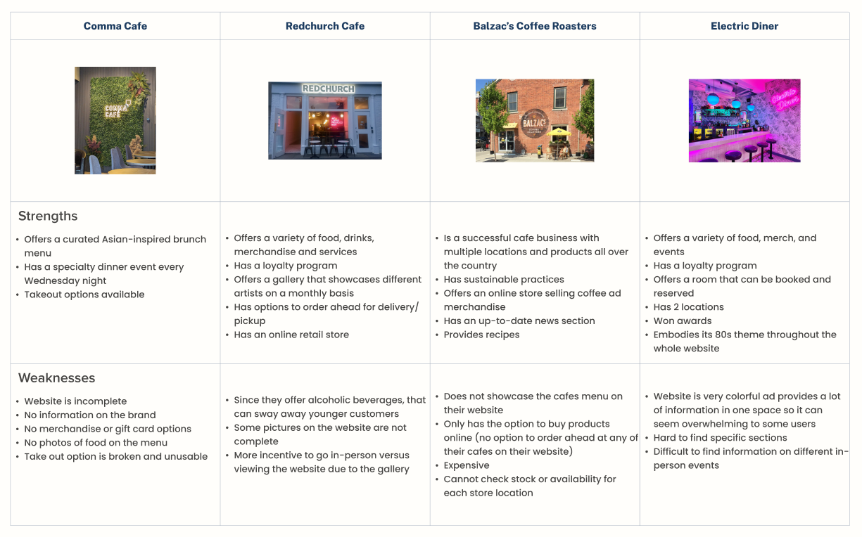
Insights
A visually appealing, easy-to-navigate website that aligns with Comma Cafe’s brand identity can improve user experience and engagement.
Communicating Comma Cafe’s story and values can build a stronger emotional connection with customers and establish a distinct identity.
Ensuring critical information is easy to find will improve customer accessibility.
Highlighting Comma Cafe’s unique features, especially its dinner service on Wednesday nights.
User Research
User Interviews
The goal of the user interviews is to understand the motivations and goals that drive users to visit the websites of cafes and restaurants.
Identify the reasons users visit cafe and restaurant websites and what they aim to accomplish.
Explore which features and pages users interact with most while browsing these websites, and understand why.
Inquire about users’ favorite cafe and restaurant websites, focusing on what they like and dislike about them.
Allow participants to review the current Comma Cafe website to gather feedback and suggestions for improvement.
Research Objectives
What did I Discover?
User interviews and research revealed clear patterns in how people use cafe and restaurant websites, highlighting gaps between user expectations and Comma Cafe’s current experience.
Usage & Reasoning
Users visit cafe websites with a specific goal in mind—most often to browse menus, check pricing, and decide whether to order or visit.
Visuals play an important role in decision-making, with users wanting to see both the food and the space.
Most interactions are quick and often happen on mobile, making clarity and ease of use especially important.
Essential Features
A clear menu with photos and pricing is a baseline expectation.
Key information such as hours, location, and contact details needs to be easy to find.
When available, online ordering and reservations should be simple and clearly presented.
Concerns & Pain Points
The lack of menu photos and cafe imagery made it harder for users to feel confident in their choices.
Users found the online ordering flow confusing and difficult to navigate.
The website felt visually outdated and did not reflect the quality or personality of the cafe.
Important offerings, such as the Wednesday dinner service, were not clearly communicated or supported.
Key Takeaways
Users expect cafe websites to be clear, visual, and easy to navigate. Improving clarity, visual presentation, and task-focused flows became the foundation for my design decisions.
Define
Affinity Map

Based on the findings from my user interviews, I can now organize the data into an affinity map. This will provide me with a visual representation that helps break down the information into key themes, making it easier for me to analyze and understand.
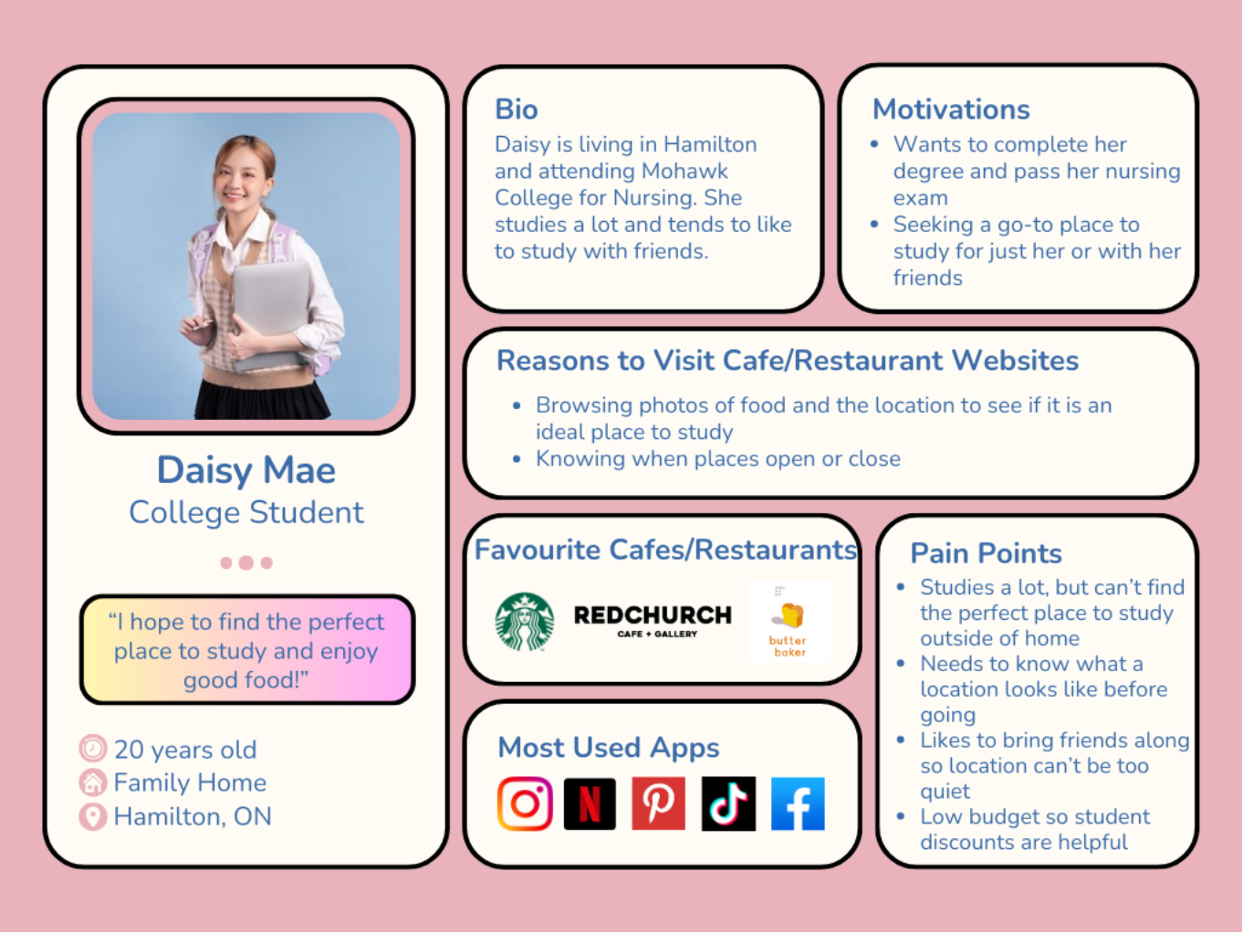
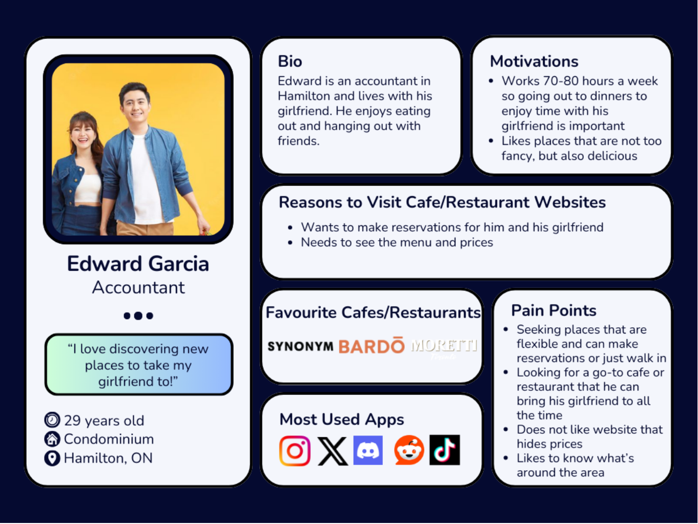
User Personas
With the data from my user interviews now organized, I can analyze it alongside my competitor analysis findings. These personas provide valuable insights into my target users and help me better understand who I’m designing these solutions for.
Defining our Problem
Problem Statements, POVs, and HMWs
Based on the perspectives of the user personas plus the data from my research, I created two sets of problem statements that reflect the challenges and unmet needs of these users. By focusing on insights and user needs, I was able to create POV and HMW statements that will help me formulate solutions to their problems.
Statement 1
Insights
Customers visiting Comma Cafe’s website often intend to place an order for pickup or delivery. However, they find the process confusing, with unclear instructions on how to begin. Additionally, users discover that the website doesn’t offer delivery options.
Needs
Users should be able to easily order food on Comma Cafe’s website for pickup and/or delivery when needed.
POV
Daisy is in a rush to get to school so she decides to make an order ahead for pickup to save time. Once she goes on the website to do so, she gets confused on how to make that order.
HMWs
HMW direct the ordering process for Daisy so she can identify how to make a pick up order easier?
HMW make the ordering process faster and more convenient?
HMW help make the process easier for Daisy to make future orders?
Statement 2
Insights
Many customers and potential customers of Comma Cafe do not know about the dinner service on Wednesday evenings since it is not listed anywhere on their website.
Needs
Users should be able to access information on the dinner service and additionally be able to make a reservation.
POV
Edward wants to take his girlfriend out to dinner for their 2 year anniversary. He learns about Comma Cafe’s dinner nights through a friend, but when he goes on their website to make a reservation, he discovers that he is unable to leaving him confused.
HMWs
HMW show Edward and other users information on the service so that they can learn more about it?
HMW allow Edward to easily make a reservation online through Comma Cafe’s website?
HMW make Edward’s reservation accessible to him after the reservation has been made?
Key Findings
Actionable Insights
Designing an Ordering and Reservation Process
Currently, there is no system in place on Comma Cafe’s website to successfully place an order for pickup/delivery or make a reservation. Creating this is vital for Comma Cafe customers based on my research.Enhancing the Menu
Users may be hesitant to order if they don’t have a clear understanding or view of the menu items. I must Improve the menu presentation with high-quality photos of the dishes, detailed descriptions, and ingredient information to build confidence in making an order.Website Responsiveness
Ensuring the website is fully optimized for not only web viewers but also mobile users. A lot of users may want to order on their mobile devices so I must make sure it is a responsive design that makes it easy to browse, order, and pay
Ideate
Feature Set
With the project goals clearly defined and actionable insights identified, the next step is to translate these objectives into features. Below I have listed a few of the features that I believe will help solve the pain points of the users from Comma Cafe’s current design:
Landing Page: A new page that users first see when visiting Comma Cafe’s website.
Book Reservations: A way for users to make a reservation in advance for the Wednesday night steak dinner.
Menu: A revamped menu featuring photos, prices, and descriptions for each of their items.
Pick Up and Delivery: A brand new system for users to make orders for pick up or delivery.
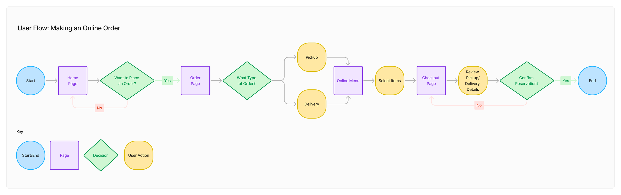
User Flow
Below I have mapped out a user flow that highlights the action of a user making an online order. This flow illustrates the various paths a user can take to completing an online order, whether it is for pickup or delivery. By visualizing these actions as a flow, it identifies alternative routes and options a person may take, and this will act as the roadmap the UI of the website will reflect.
Wireframing
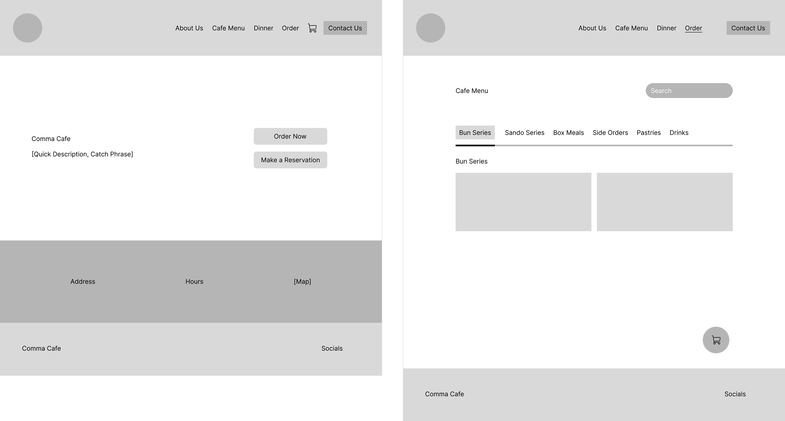
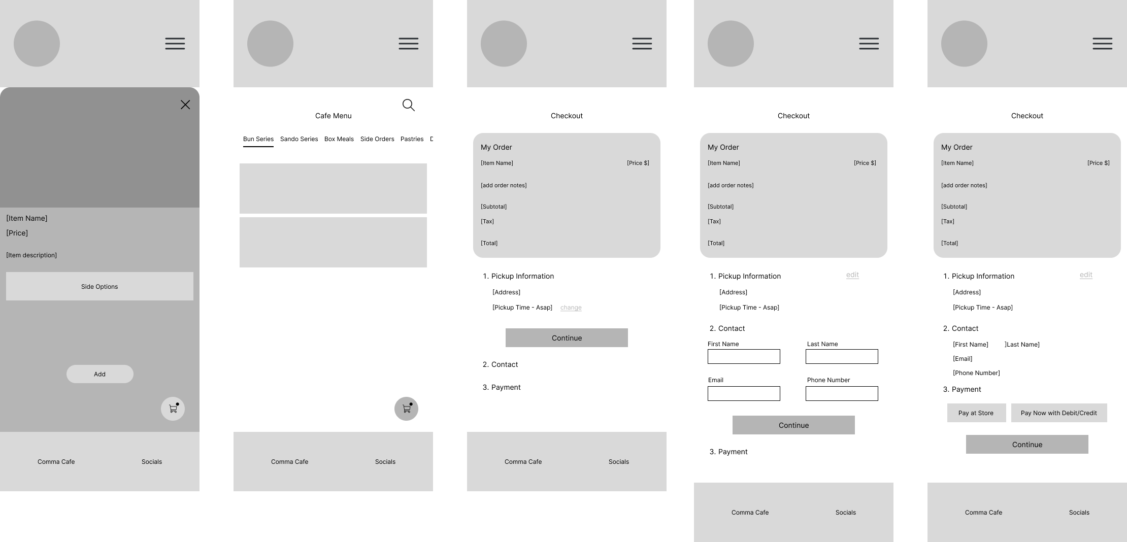
Mid-Fidelity Wireframes
For my initial wireframes, I chose to begin the design process digitally by creating mid-fidelity wireframes. While there are several reasons for skipping low-fidelity sketches, the main factor was time efficiency. Given that this project requires both desktop and mobile versions of the designs, I decided to jump straight into Figma. This approach allowed me to save time, as the mid-fidelity wireframes already defined the core structure and layout, making the transition to high-fidelity designs much smoother.
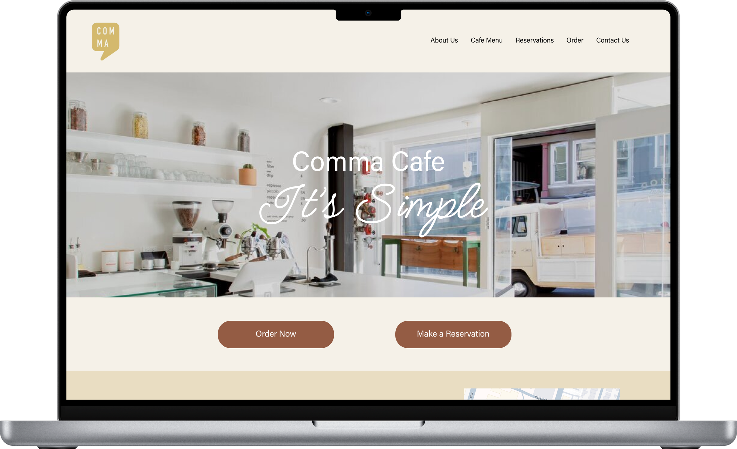
Prototype
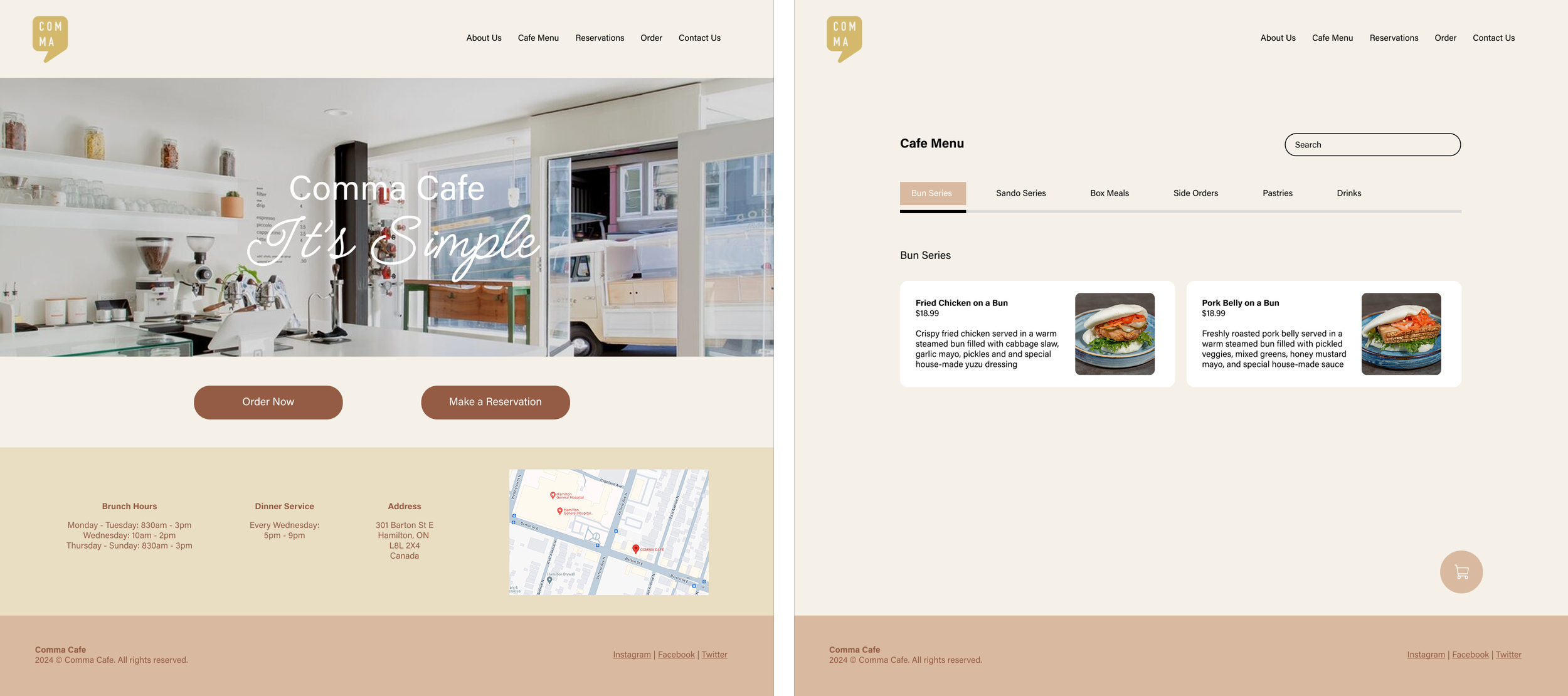
High-Fidelity Wireframes
Using my mid-fidelity wireframes as the skeleton of my design, I can now start creating my high-fidelity wireframes. I began by refining the structure of my landing page and smaller elements, then added the color schemes, logos, and photos into my design. With the high-fidelity wireframes complete, I ensured the designs were functional and ready for prototyping.
Test
Usability Testing
Objective
To evaluate the usability of my high-fidelity wireframes for the redesigned Comma Cafe website and identify potential improvements for enhancement.
Interview Style & Methodology
Interviews were conducted 1:1 via FaceTime, in-person, or Discord.
Number of Participants: 5
Task Flows:
Task Flow 1: Adding item(s) into the cart.
Task Flow 2: Checking out item(s) in the cart.
Desktop
Task 1 - Results
3/5 users experienced at least 1 error during the task
(3) clicked on just the circle when trying to select a side item and wasn’t able to select it.
100% of users were able to successfully complete the task.
Task 2 - Results
3/5 users experienced at least 1 error during the task
(3) users wrongfully clicked a ‘continue’ button before they were supposed to.
1/5 users was confused on the first step from transitioning between task 1 and 2.
100% of users were able to successfully complete the task.
Mobile
Task 1 - Results
3/5 users experienced at least 1 error during the task
(1) clicked on just the circle when trying to select a side item and wasn’t able to select it.
(1) clicked on a blank space when trying to open an item’s information.
(2) users got confused when leaving the screen after adding items to their cart.
100% of users were able to complete the task successfully.
Task 2 - Results
2/5 users experienced at least 1 error during the task
(2) users wrongfully clicked a ‘continue’ button before they were supposed to.
100% of users were able to complete the task successfully.
Interview Insights & Feedback
Add a delivery method/option within the ordering system.
Changing to social media logos instead of words themselves in the footer section.
Adding a ‘quick add’ button for adding an item to the cart.
The colors of some buttons should be the same on desktop and mobile (the cart button).
Some screens felt too “plain”.
Buttons should be greyed out to show that the user cannot continue or click yet.
Add a better indicator for when an item is added to the cart.
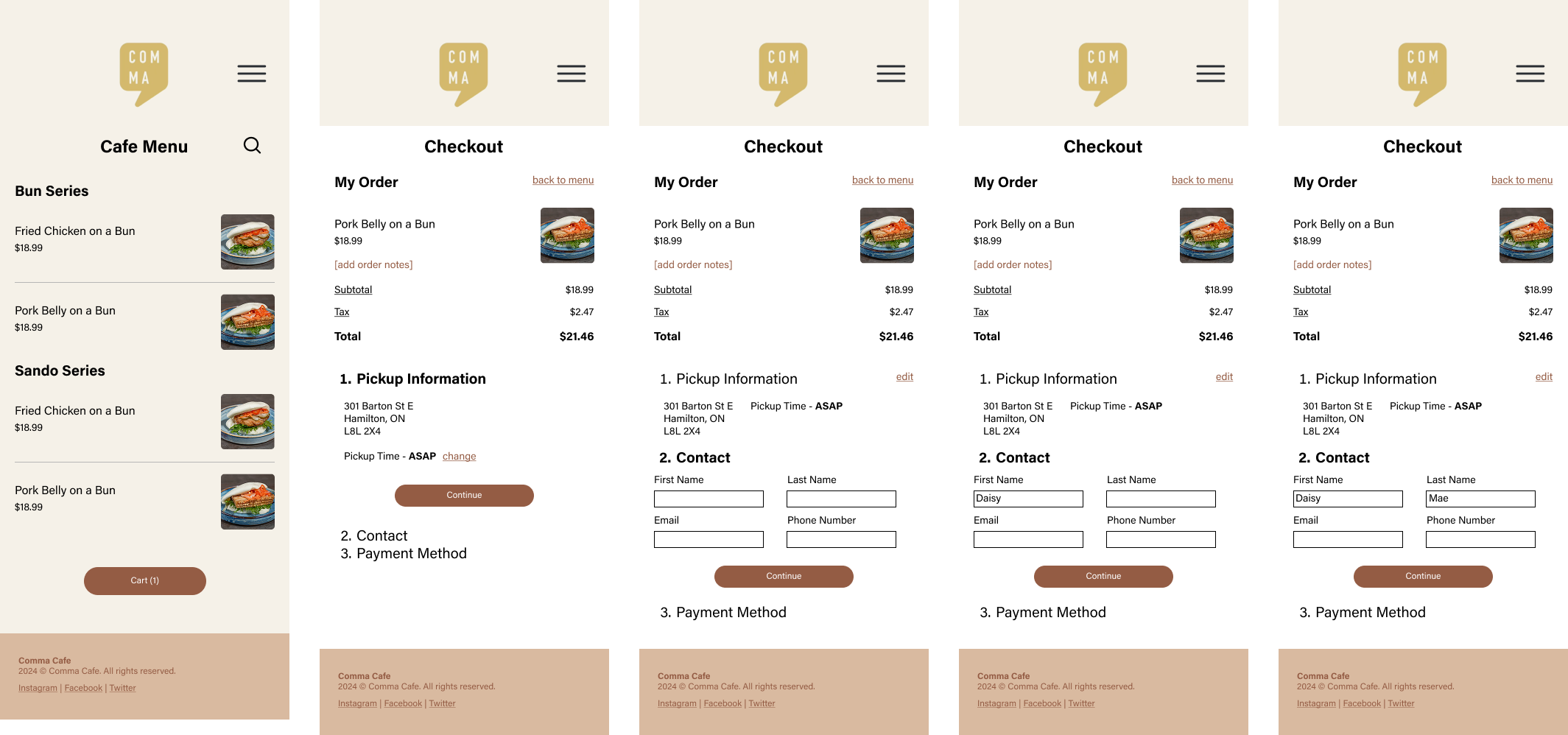
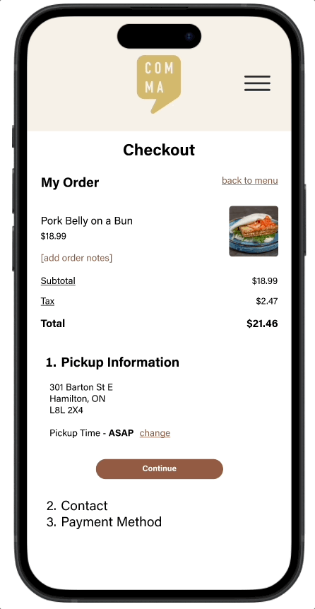
The ‘My Order’ section takes up a lot of space on the checkout screen (mobile).
Priority Revisions
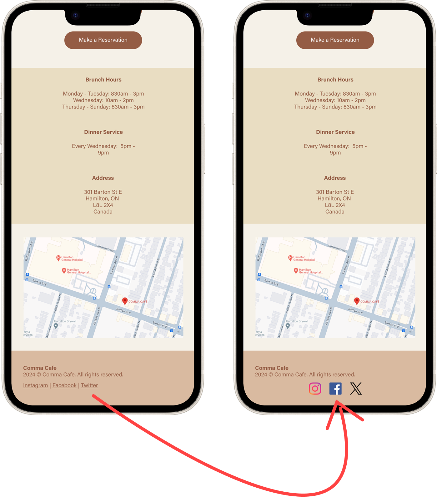
Social Media Icons
After reviewing the feedback, I began implementing changes to enhance my designs. The first adjustment was replacing the social media links in the footer. Initially, I opted to display the platform names as text, believing it to be an accessible choice. However, a comparison test with users revealed that 4 out of 5 participants preferred recognizable social media icons over text, prompting this update. This taught me the importance of balancing accessibility with user preferences to create a more intuitive design experience.
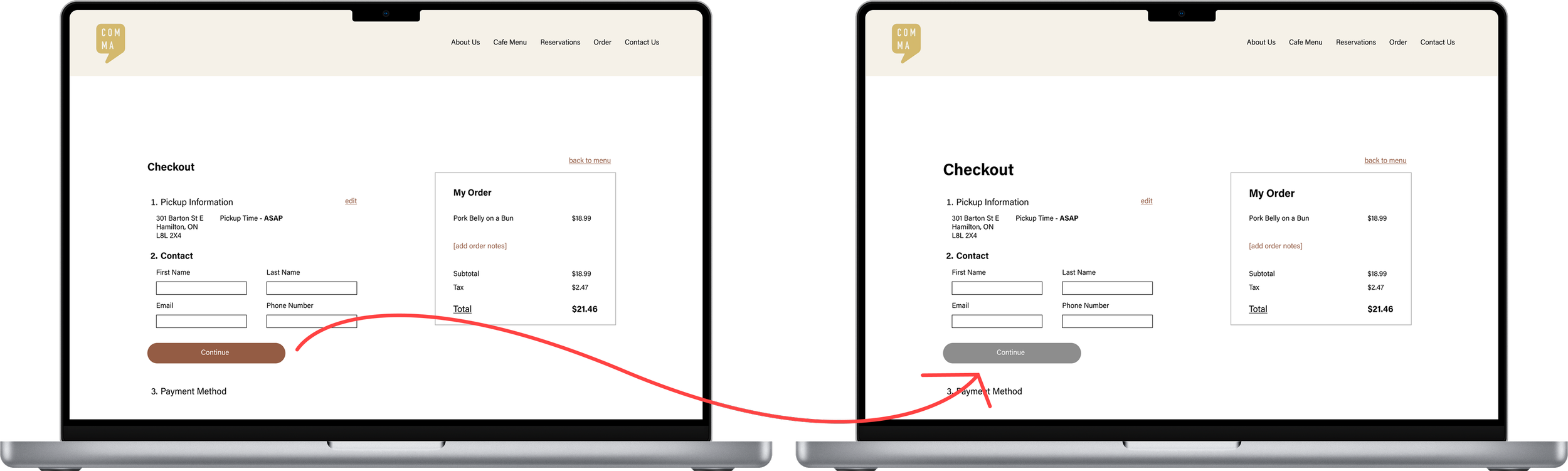
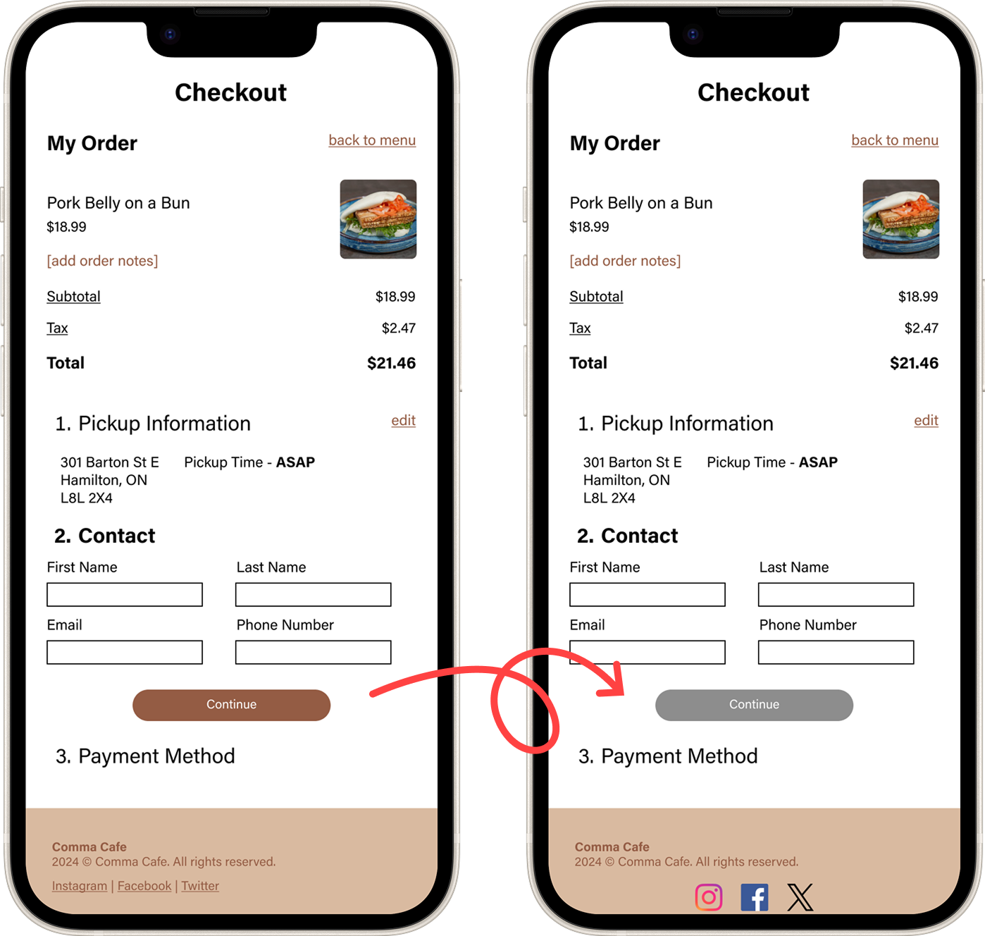
Correcting Button Interface
During the testing phase, both users and I identified a flaw with the "Continue" button on the checkout page in both desktop and mobile versions. The button appeared in an "active" state—allowing users to click it—even when they hadn't entered their contact details. Its brown color gave the impression it was functional, which led to several user errors. To address this, I learned that changing the button to grey effectively communicates its "inactive" state, making it clear to users that they cannot proceed until all required fields are completed.
To finish off my revisions based on the feedback from my user testing, I implemented the changes below to further enhance the usability and overall experience of my prototypes. The changes are as follows:
Enlarged and Emphasized Text for Visibility
Certain text elements were resized and given greater emphasis to improve their visibility and ensure users could easily read important information across both desktop and mobile versions.Aligned Cart Button Design Across Devices
The cart button color on the desktop version was updated to match the mobile version, creating a cohesive design and maintaining visual consistency across devices.Added Dynamic Interaction Paths
Additional interaction paths were incorporated into the prototype, making it more dynamic. These updates provided users with multiple options for navigating and completing tasks, improving the overall flexibility of the experience.Enhanced Button Clickability
The clickability of certain buttons and interactive items was improved to ensure users could easily engage with key features without frustration.
Final Prototype
Takeaways & Next Steps
Reflection
Redesigning Comma Cafe’s website has helped me deepen my understanding of responsive design and the role it plays in creating a consistent user experience across devices. Designing for both desktop and mobile reinforced the importance of adapting layouts, hierarchy, and interactions while maintaining visual and functional consistency.
I also learned how critical small design details are to overall usability. Subtle changes—such as button states, text hierarchy, spacing, and visual cues—had a significant impact on how intuitive the experience felt for users. This project strengthened my ability to identify and refine these details, reinforcing that effective design is often the result of thoughtful iteration rather than large visual changes.
Next Steps…
Moving forward, I would conduct additional usability testing to validate the recent design changes, further strengthen the responsive experience, and refine interaction details. These insights would guide continued UI and accessibility improvements that better support both customer needs and the business goals of Comma Cafe, ensuring the website effectively serves its users while helping the cafe grow.